
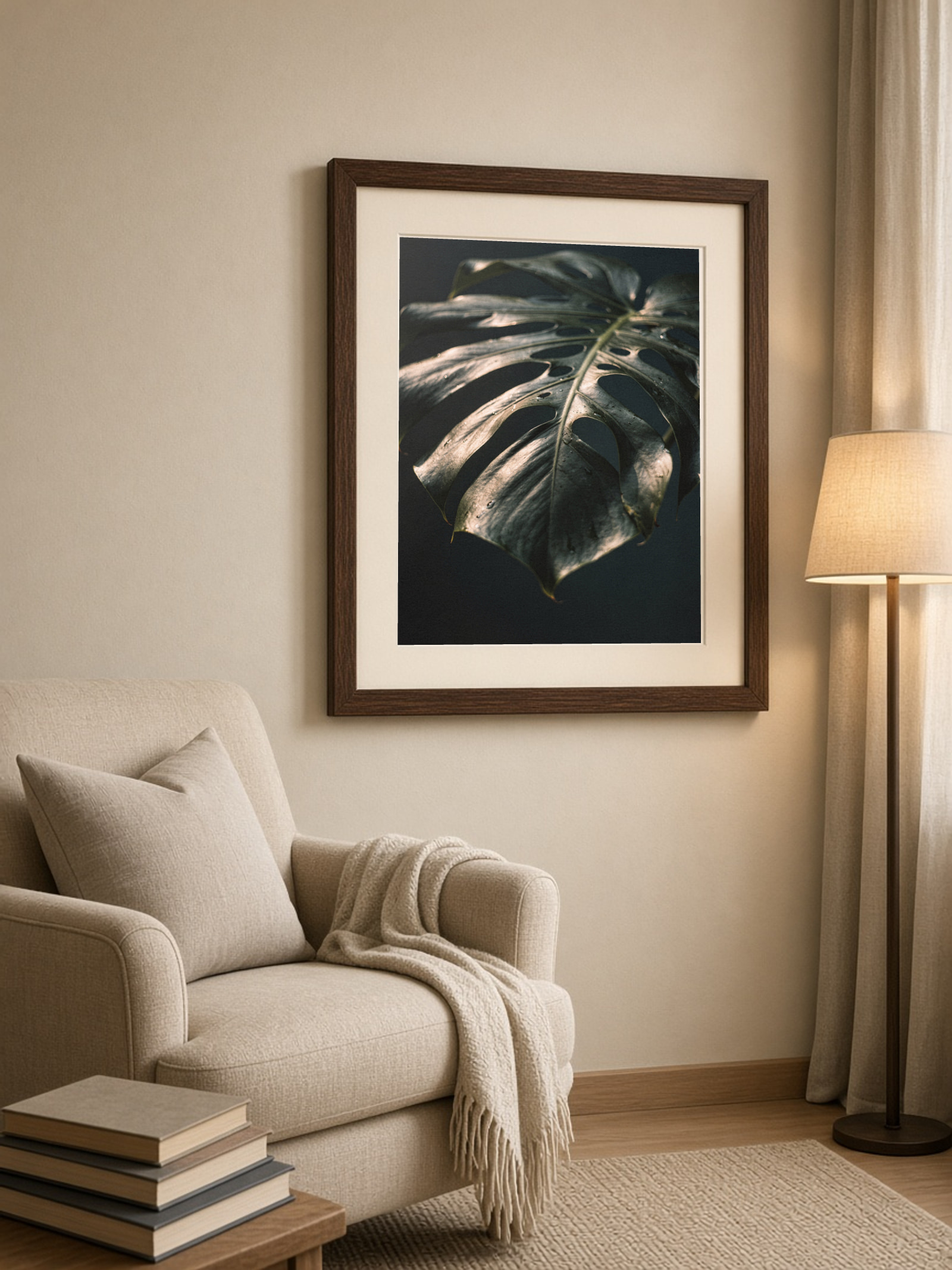
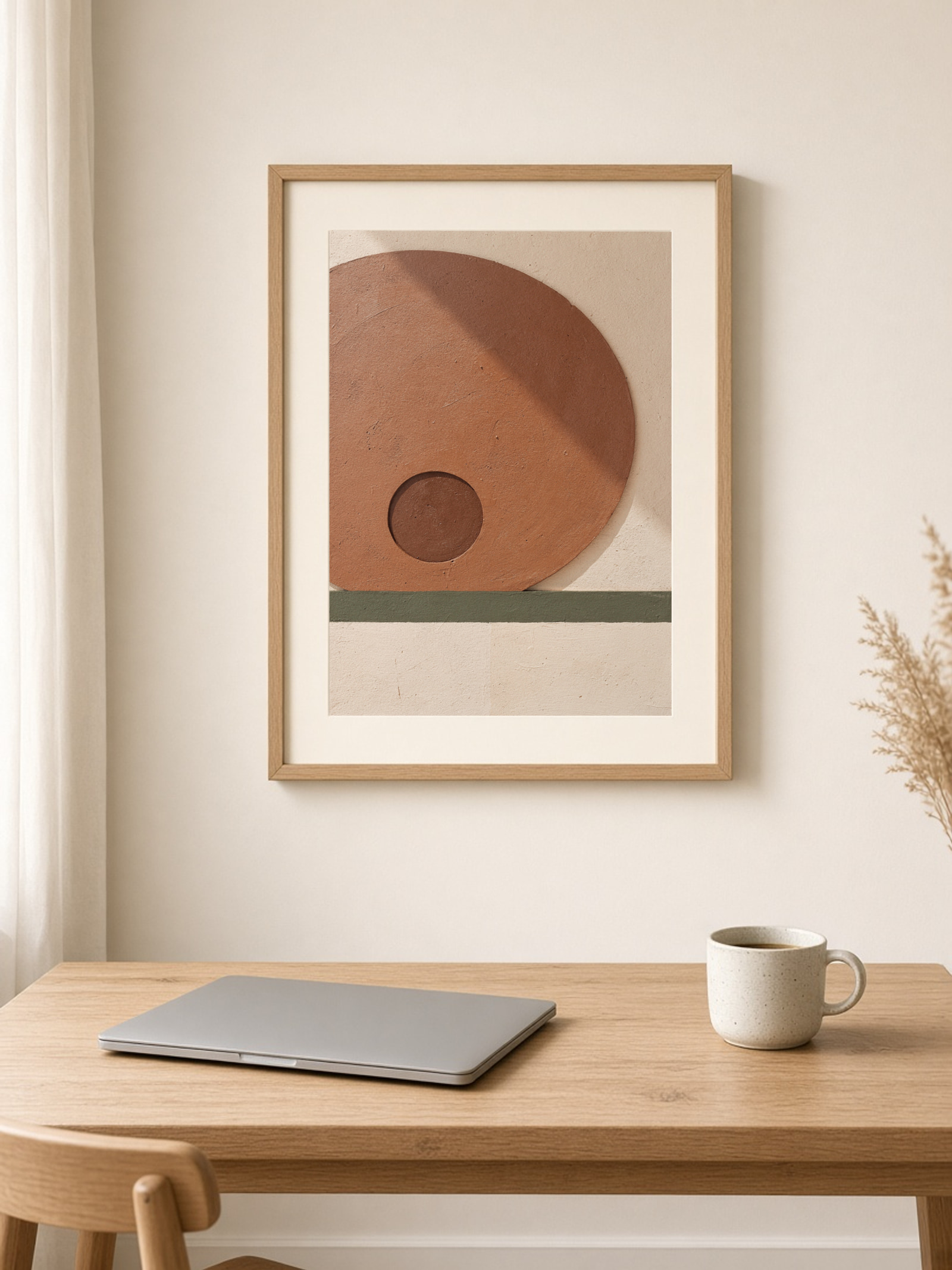
A frame is the difference between a poster and a picture. I usually look at two things: the colours in the print, and what else is made of wood in the room.
Light oak
My default for warm, light rooms and for prints with beige, terracotta and green. It works with most furniture and never feels heavy.
Dark wood
Good with darker prints and older furniture, like a bookcase or a leather armchair. It makes the picture feel a bit more serious.
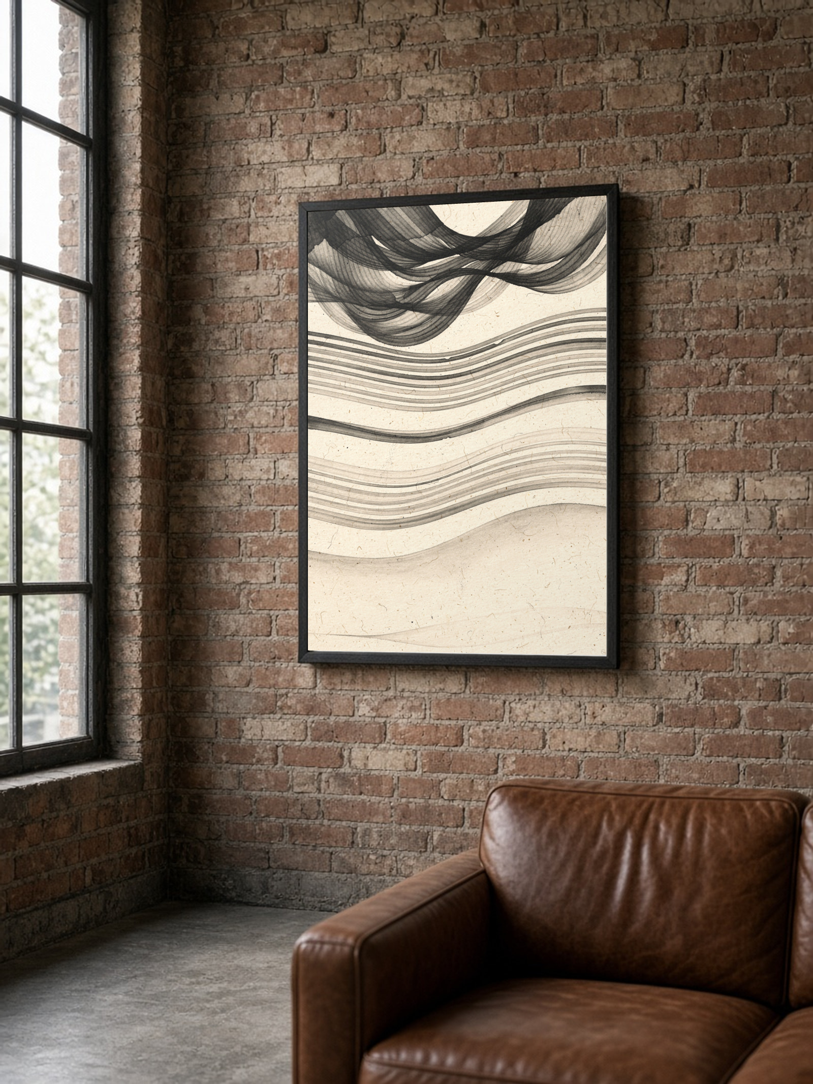
Black
The most graphic choice. Great for black-and-white photography, typography and prints with strong contrast. Against brick or a dark wall it almost disappears, and the picture takes over.
White
Quiet and Scandinavian on light walls, especially with soft colours. On a white wall it can look a bit unfinished, so add a white border to the print.
Full bleed or white border?
On the product page you can choose whether the motif goes to the edge or has a white border around it. The border gives the picture breathing room and makes even a simple frame look expensive. I choose a border for calm motifs and full bleed for graphic prints that should feel bold.
Without a frame
If you want to skip the frame, canvas is stretched on a wooden frame and ready to hang straight away.
Not sure about the size yet? Start with poster sizes explained, then come back to the frame.
See also
Bestsellers