
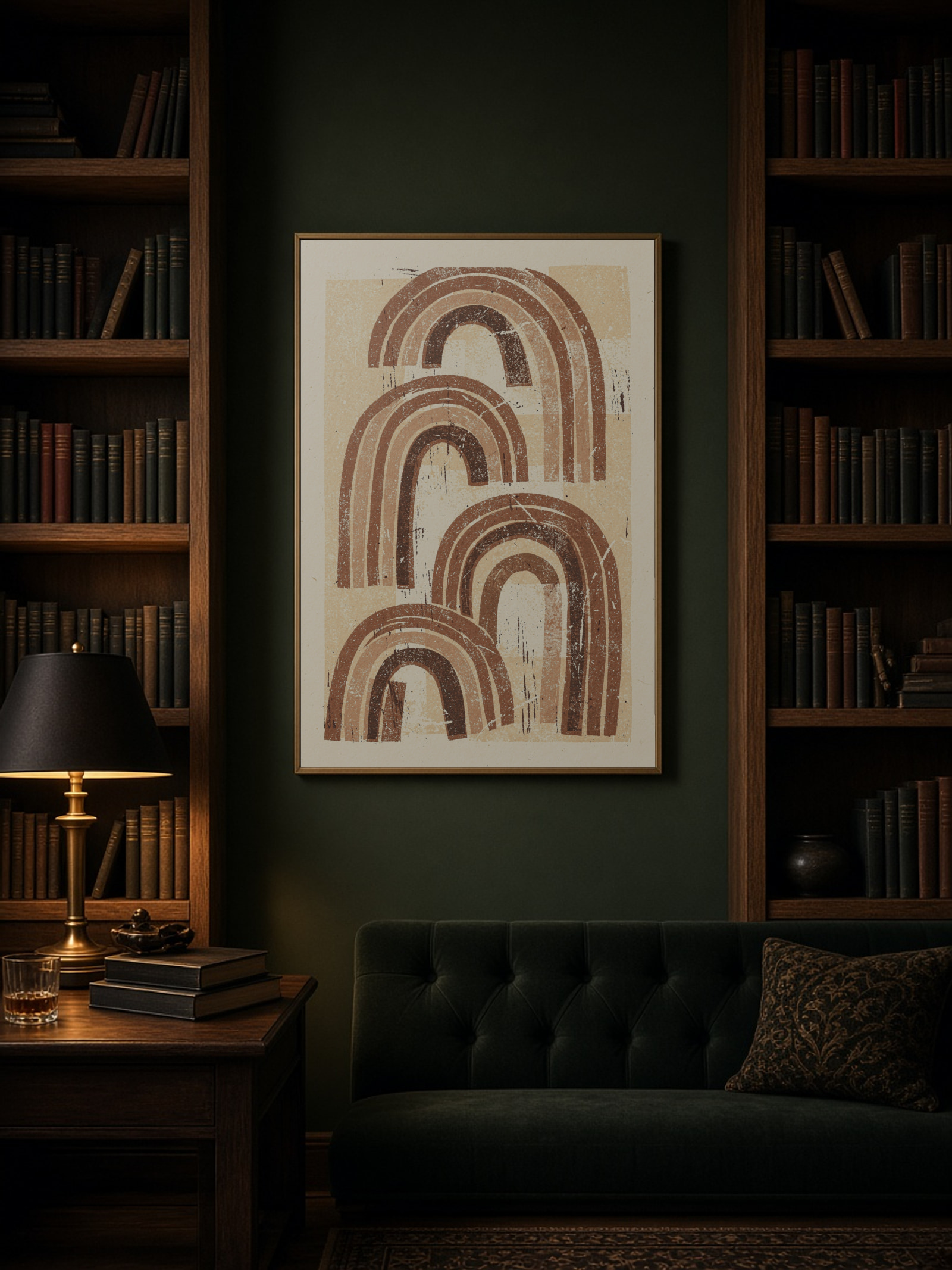
A gallery wall goes wrong when every frame has its own idea. It works when the gaps are the same, the edges line up, and the colours repeat. Before you hang anything, cut the frame sizes out of newspaper and tape them to the wall for a day.
Three layouts I keep coming back to
- One big, two small. A 50×70 in the middle with a 30×40 on each side. Easy and calm.
- The grid. Four or six frames of the same size with exactly the same gap. Works best with prints in a series.
- Shared outer edge. Mixed sizes, but everything lines up against an imagined rectangle. More relaxed, still tidy.
The gap
I use 5–7 cm between frames. Smaller than that and it looks cramped, larger and the pictures stop belonging together. Whatever you choose, keep it the same everywhere. That matters more than the exact number.
Height
Hang the group as if it were one picture: the centre of the whole group about 150 cm from the floor. Above a sofa, start from the bottom instead and leave 20–25 cm above the backrest.
Colour
Let one or two colours recur across the prints. A rust tone that shows up in three of five pictures ties the wall together, even if the motifs are completely different.
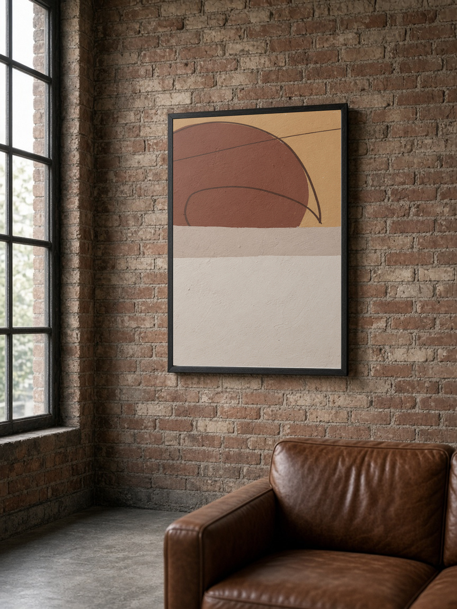
If you would rather skip the planning, our gallery walls are put together so that sizes and colours match. To hang them without new holes, read how to hang posters without damaging the wall.
See also
Gallery walls